


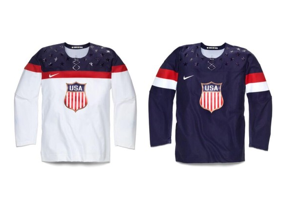
On Tuesday, Nike and USA Hockey unveiled the new uniforms for the Olympic team’s that will be participating in Sochi. These uniforms had potential, but fell short of being a fantastic uniform. The striping used on each uniform is great and so is the font for the numbers and names, but the crest is disappointing. 
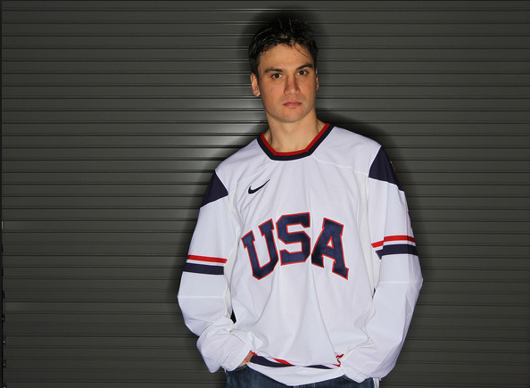
They could have made the uniforms a lot better by just simply putting “USA” on the front, like the 2010 Olympic jerseys in the photo below.
 But, Nike can’t do something like this, because they are practically incapable of not changing uniforms from year to year. The biggest issue with these jerseys isn’t the logo on the front, rather it is the fake string at the front. If you’re going to put lace in the front of the jersey, just put it on there, don’t put a fake plastic overlay there instead. The stars were an out of the box idea and don’t look too horrible, so I’m not sure I can call that an outright failure, but it’s close.

Putting two gold medals with 1960 and 1980 next to them in the collar to commemorate the U.S. gold medals for men’s ice hockey is a pretty cool tribute, and by far the best thing Nike did with these jerseys. If they had just chosen a different crest, these jerseys could have been pretty good instead of pretty terrible. What do you think of the jerseys? Would you like to see USA bring back the jerseys from the 2010 Olympics instead? Vote in our polls below.