


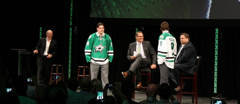
After accidentally leaking their own new logo, the Dallas Stars finally held their new “rebranding” press conference to show off their new logo and uniform on Tuesday. The Dallas Stars said that they worked with the NHL and Reebok creating the new logo and uniform and that they went through over 236 variations of uniform, logo and striping combination over the one year process.
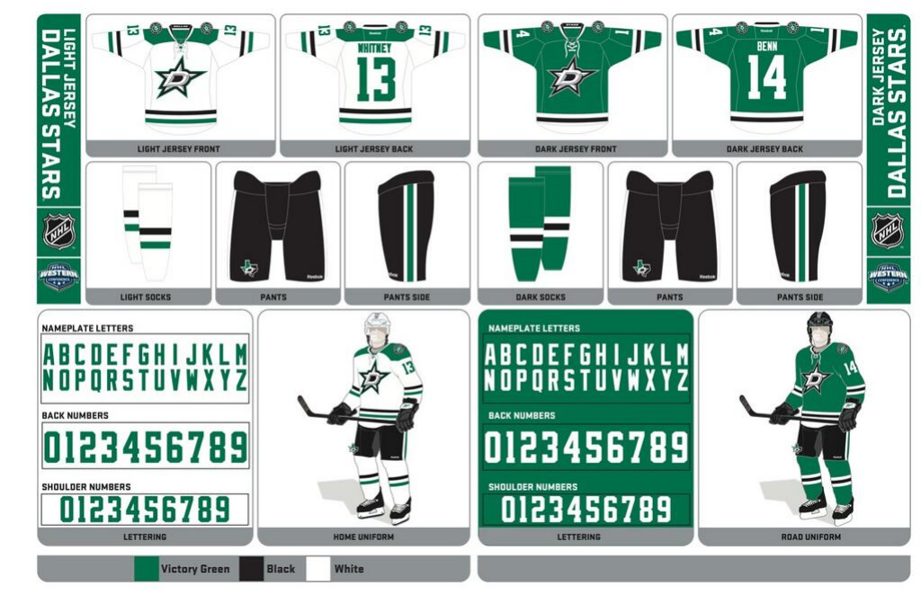
Personally, I like the old logo much better. I prefer the gold/green combination over the green/silver, but the design of the new logo isn’t too bad, it’s just not great. Dallas Stars owner Tom Gaglardi said that they went with silver because stars appear to be more silver in the sky. The uniforms though have a real nice clean and classic look to them. There isn’t too much clutter, and the shoulder patches and striping does a good job accenting the uniform and the main logo. The logo actually looks much better on the uniform as opposed to sitting by itself, and they picked out a great font for the numbers and names.
To those asking to see the new alternate mark from the pants. Check it out. #NewStarRising pic.twitter.com/UezkVIMdxH
— icethetics (@icethetics) June 5, 2013
The logo on the pants is great, and I actually wouldn’t have minded if that was the logo on the shoulder instead of the circular, Starbucks-esque logo.
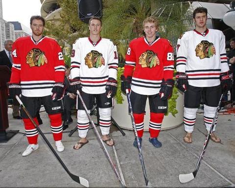
The design of the home and road uniforms aren’t actually that different from the new Carolina Hurricanes uniforms that were revealed earlier on Tuesday or from the Chicago Blackhawks jerseys for that matter.
The Dallas Stars also announced they will be retiring Mike Modano’s #9 in a ceremony.
The Dallas #Stars will retire @9modano 's number 9 on March 8th, 2014. #NewStarRising
— Dallas Stars (@DallasStars) June 4, 2013
[Stars.com] [@Icethetics]