Categories: NCAA Football

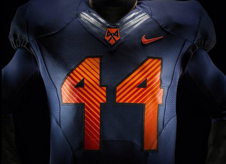
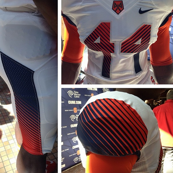
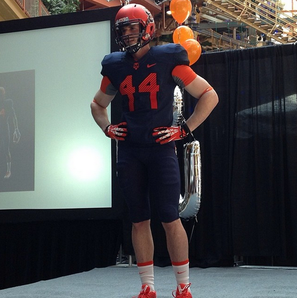
New Syracuse Football Uniforms Have Bizarre Font

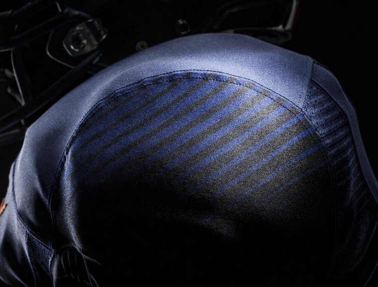
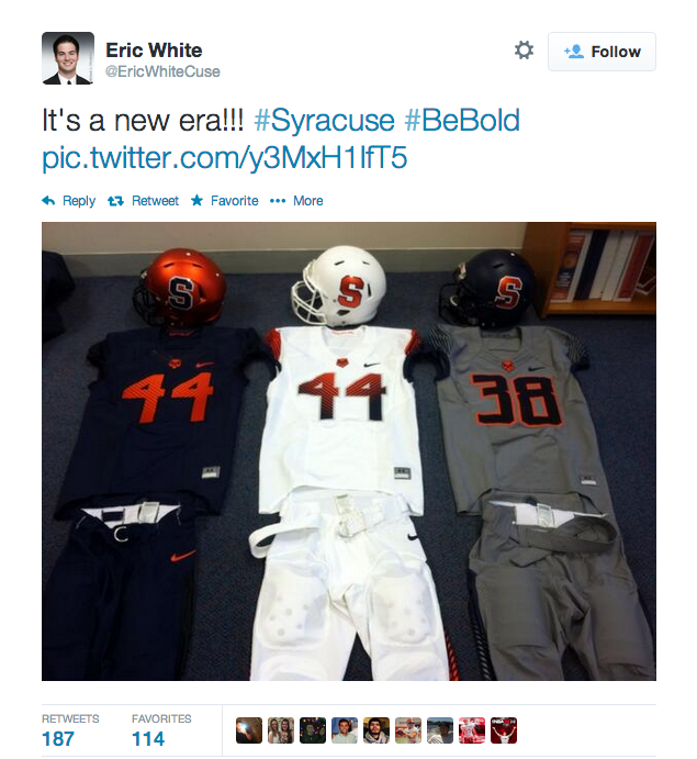
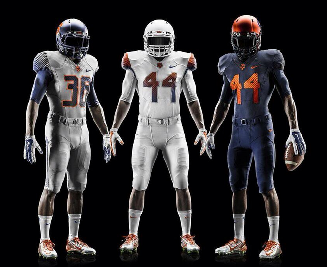
I’m not quite sure what was going through Nike and Syracuse’s heads when they designed these jerseys. They’re keeping the helmet they debuted from last year, which is pretty awesome, but the font they used for the numbers is just bizarre. The jerseys had potential, but the numbers completely blew it. The grey jersey looks pretty terrible in comparison to the other two as well.

[@NikeNYC] [@PhilHecken]

diehardsport

Recent Posts

Top In-State Recruit Names Michigan A Finalist, Set To Announce Today

A four-star DE out of Farmington Hills, Michigan, Myles Smith is set to make his…

4 months ago

Basketball Recruit, With Major Michigan Connections, Debuts As No. 1 Recruit In Country

The son of Jamal Crawford, JJ, is going to be 'next up.' Recently tabbed as…

4 months ago

Michigan Trending To Land Top SEC Territory LB

The Wolverines are in prime position to land three-star LB Brayden Watson out of HS…

4 months ago

Michigan Trending To Land An Elite WR Prospect

Michigan is primed to land Chicago, Illinois WR Quinten Burrell. Tabbed as a top 100…

5 months ago

Reading the Tea Leaves: Is Morez Johnson NBA-Bound or Coming Back?

While Morez Johnson already entered his name into the NBA Draft but with the option…

5 months ago

Could This Be Michigan Basketball’s Starting Lineup Next Year?

The Wolverines may add one or two more players in the transfer portal but here's…
5 months ago