


After seeing many schools release new uniforms this offseason, the Miami (OH) Redhawks are the clear cut winners of the worst new uniforms. In fact, the Redhawks may have entered into a tie with the Maryland Terrapins for the worst uniforms in all of college football.
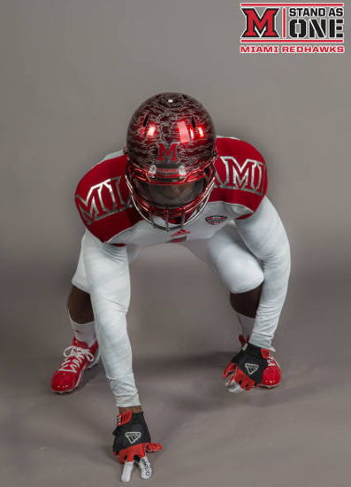
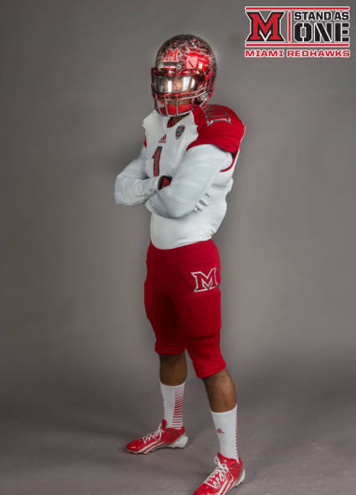
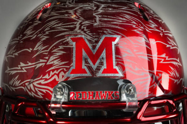 Miami’s helmet is absolutely brutal. The traditional block M is on the front of the helmet with “Miami” written on the back, while the entire helmet is styled to look like it has feathers.
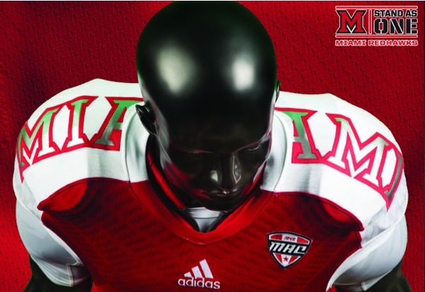
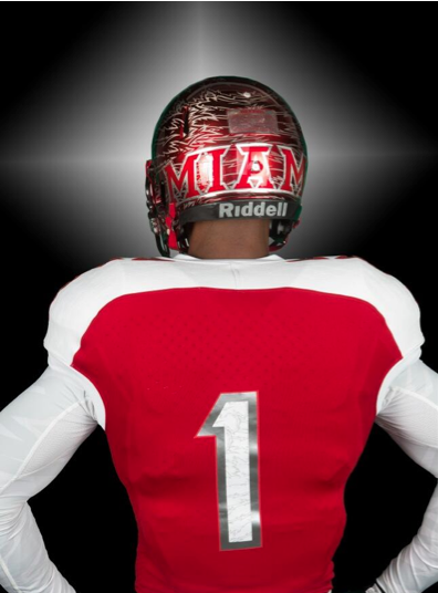 The jerseys themselves wouldn’t be that bad, if they didn’t have “Miami” written across the shoulders. The Miami on the red jersey even has green on it, which doesn’t make any sense because it isn’t a school color.
 Adidas and Miami really whiffed on these uniforms. They were trying to think outside the box and be unique, but what they ended up with was a truly horrible product.